Posts Tagged ‘this place my home’

GORGEOUS MODERN HOME REMODEL

Tuesday, October 24th, 2017

modern home remodel| Where is June?

Disclaimer:  This is one of my best friend’s home.  It’s still beautiful though!

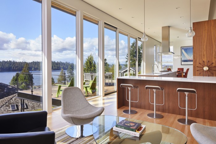
The remodel of this modern home is featured on dwell.com!  After moving in, my friends knew they wanted to open up the main floor so the dining, kitchen and living spaces flowed and accentuated their knock-out view.  They are both engineers, so to say they are exacting is an understatement.  Elements such as raising the ceiling, adding pops of orange on the exterior, outlets in the drawers (in order to keep a clean counter),  to trimless interior doors and a freestanding stove were all deliberate.  Their attention to detail paid off.  The amount of natural light that flows into this home is amazing and essential in the PNW.  In the summer months, the deck becomes an additional living space and is ideal for lounging and entertaining.

modern home remodel | Where is June?

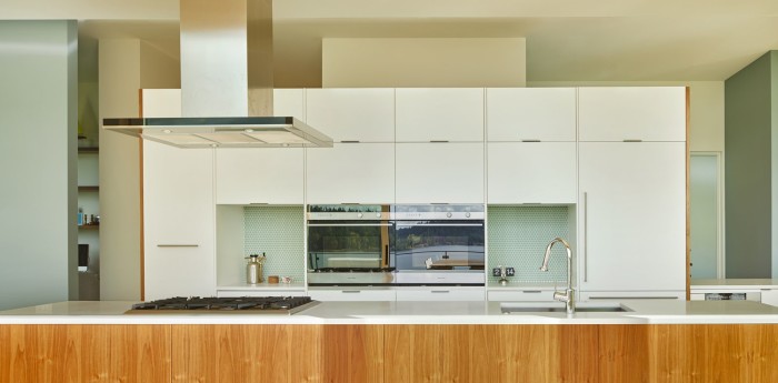
I’m in love with the simplicity of this kitchen.  Can you spot the fridge?  Covering the refrigerator door with a cabinet front makes the kitchen seamless and cohesive. My favorite feature of this kitchen?  Two beverage drawers that can be stocked for parties and everyday living.  Brilliant.

modern home remodel | Where is June?

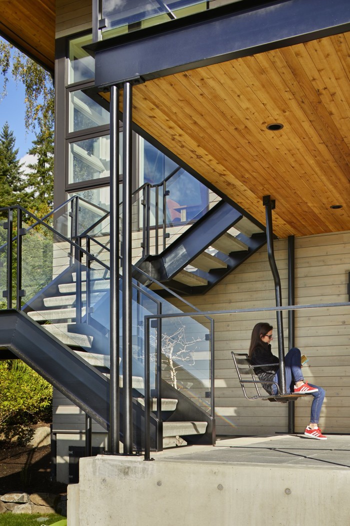
A staircase was added from the upper deck to the back yard, which was lacking before the remodel.  The covered patio underneath provides ample shade in the summer.  An old chairlift from Crystal Mountain transformed into a swing was seemingly destined to be part of this home.  The project may have taken 6+ months, but it was well worth it!

To see more photos of this home, pop over to Dwell.

Photos by Benjamin Benschneider


Save

INDEPENDENT SHOP: ONE FORTY THREE

Wednesday, October 4th, 2017

one forty three | Where is June?

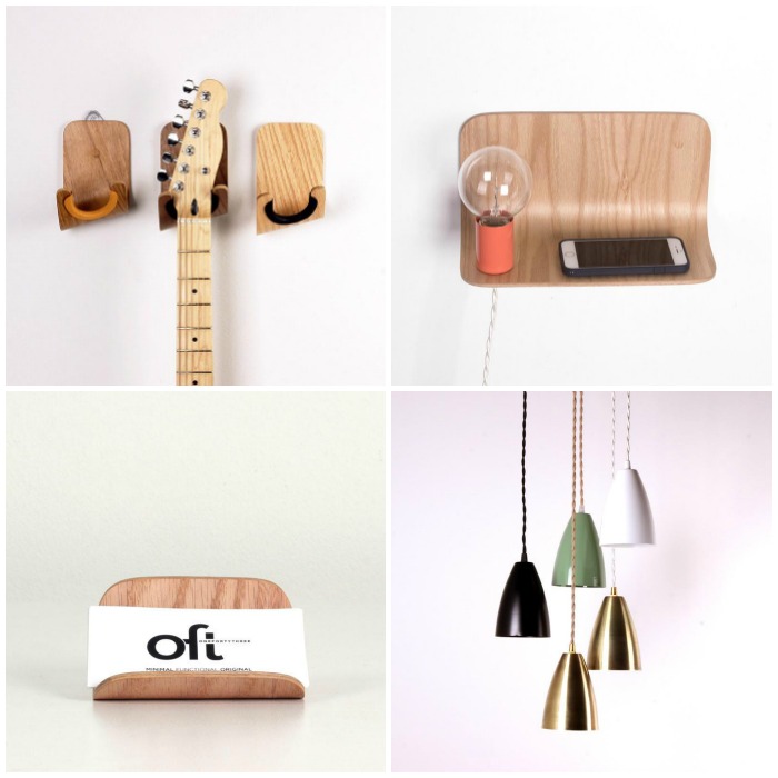
I’m known to fall down a rabbit hole time and again!  I want something for my home, or my boys, or my wardrobe and I know that Google will give me the answer.  A couple of years ago when we were remodeling our family room I decided I wanted to hang my guitar on the wall. (Insert shameful emoji that I haven’t shared more about the finished project.  Are you still interested? I digress!) Guitars are so beautiful they can easily be used as wall art.  Lo and behold, my guitar hook wishes were granted by One Forty Three.  The hook is made of molded plywood with a leather grip to keep the guitar safe.  It’s gorgeous.

What?  You don’t have a guitar you want to hang on the wall?  Don’t fret.  They have so many amazing products.  Lighting, tables, chairs, and accessories.  Check them out!  I’m still in love with that delightfully cute plywood side shelf.  It would be perfect next to a guest bed.

Pictured above clockwise // guitar hook | side shelf | pendant lights | business card holder

Also, if one of you could please come over and force me decide where to hang my beautiful guitar, I can install the hook and share a picture.  (Add another shameful emoji.)


ADDING INTEREST TO A BEDSIDE TABLE

Monday, October 17th, 2016

drawer-title
single-drawer-and-pull | where is June?

My bedroom needs some major TLC.  The only thing we have purchased for our room in the 10 years we have lived in our home is our mattress and box spring.  I hesitate to do much because we know we want to remodel {in a huge way}!  However, the bedroom will be the last thing tackled on our long list of updates, so I’m thinking I should do a few little things that will make me like our room a bit more.

Our nightstands are maybe the easiest items to start with.  The current nightstands are one of the first purchases we ever made together, before we were married, in 1998.  Heavy, reclaimed pine with weathered hinges. Can you picture them?  I want to update them with simpler lines that fit our current style.  The nightstand with a single drawer seems like the perfect piece.  A place to stash lotion, headphones, and a lint roller-with plenty of space for a side lamp and books.  To add interest, I would swap the hardware that comes with the piece with a unique cabinet knob.  It is an easy and inexpensive way to make a statement.

Here are a few pairings that I am crushing on:
{from top}

1//  Color blocked nightstand with Geode knob.

2//  Mixed material nightstand with Simple black knob.

3// Metal nightstand and Cement knob.

4//  Mid-Century nightstand with Marble/Wood knob.

Which is your favorite?


Save

Save

Save

A STYLED BOOKSHELF

Monday, December 14th, 2015

styled book shelf | Where is June?

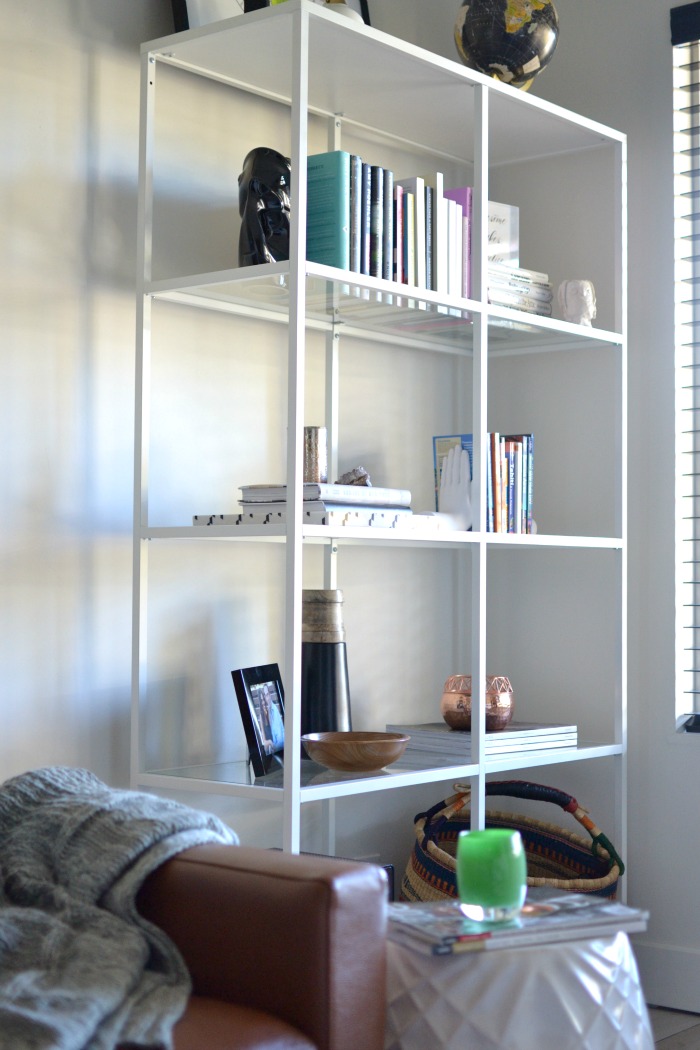
I have been working over the last few months on the finishing touches in my newly remodeled family room.  It surely doesn’t happen over night.  One item we needed was shelving to house our cable modem.  While completely unsightly and not the least bit aesthetically pleasing, it is a necessity of modern-day life.  I chose a very simple unit from IKEA. The white frame and glass shelves makes it an unobtrusive piece of furniture in the room.

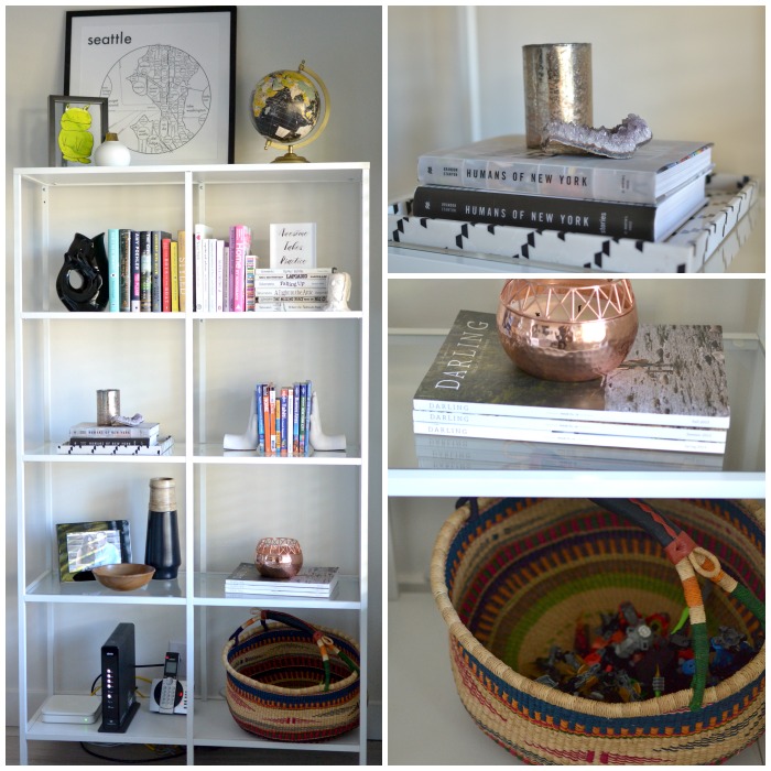
After finding a home for all of our hardware on the bottom shelf, I was left with the task of styling the rest of the shelves.  My hope is that as time goes by it will be home to items I love and collect.  I see a family of vintage globes living on the top shelf.  For now, I needed to start with a few things that I had on hand.  Taking tips from Emily Henderson, I focused on a few key elements.  Trays, larger scaled pieces, books, small collections, and cherished items.  Please remember, I am not a designer or a stylist.  I use a little inspiration from the experts and do my best.

styled bookshelf | Where is June?

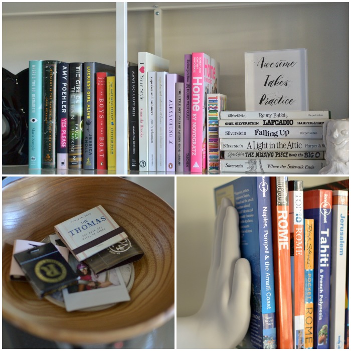
With the center bar in the middle of the shelves, it creates eight small compartments.  I tried to blur these lines a bit with a row of books running all along the first glass shelf.  I needed to use book ends {or get creative with books} to hold books upright on the shelves.  The Shel Silverstein books from my childhood, with white book jackets, were perfect for this.  I continued by adding my favorite books, a lucite tray, candles, vases, a portrait, and pieces created by my boys.  The bottom shelf has a market basket to house miscellaneous toys.  It is still a room for the whole family and those LEGOS need a place at the end of the night.  Keeping with the room’s color palette I stuck with white, black, natural wood, and metallic.  Pops of color come from the book spines and artwork.

Tiny Prints acrylic block | Where is June?

My hope was to include unique items as well.  I adore this acrylic block I created to sit on the shelves.  The phrase “Awesome takes practice.” was on a card I received for my 4oth birthday and I thought it was an outstanding mantra.  Using Tiny Prints and my favorite font, I created the text and uploaded it as an image.  It is the perfect size and looks great with the books.  Plus, it is a great reminder to be awesome everyday!

styled books | Where is June?

I know these shelves will be ever changing.  As we travel and collect new treasures, the objects will change.  I can also add items from other rooms in my home to give the shelves new life!

Sources for a few of the items:

Seattle Map print/GurglePot/Acrylic Block/Hand Bookends/Globe

{Acrylic Block c/o Tiny Prints.}


#THROWBACK #UPDATE

Thursday, October 22nd, 2015

throwback update | Where is June?

Yep, yep!  It’s #TBT, a little throw back Thursday.  I am following up on four posts from the past.  Often times I write a post and then have more to say about the topic after the fact.  Whether it be new information, a total fail, or a shift in thinking.

Limetown

I included the Limetown podcast in one of my In the Details posts.  There are only a few episodes right now {insert sad face emoji}, but holy cow!  While it is 100% fiction, it listens as if it is a first person investigative report.  The premise is a bit freaky.  An entire town’s population disappears under a cloak of mystery.  I listened to the second episode right before bed.  I will freely admit that I was totally scared and may have woke my husband up when I nearly jumped out of bed.   If you are spooked easily, I suggest NOT listening before bed.   Episode #3 was just released and I can’t wait.  Totally worth a listen!

Signature Scent

In this past post, I featured the notes I seem to love in perfume.  Upon research, it was evident that I tend to like more masculine scents.  Recently I came across a bottle of cologne I bought for my husband years ago.  {I actually think he was boyfriend when I gave it to him!}  He had it stashed in a drawer, so I decided to start wearing it.  This fall I have been layering his cologne with Elizabeth and James//Nirvana Black.  I totally suggesting giving yourself a light spray of men’s cologne-I think you may love it!

Pumpkin Brownies

Ok, so I really wanted these to be perfect. I featured them just last week in my latest In the Details post.  We did not love them.  However, I am willing to experiment and see if I can make them work.  First of all I used a gluten free brownie mix that was slightly smaller than the mix that was called for in the “recipe”.  I am thinking that the proportion of mix to pumpkin was off, which messed with the texture.  Also, I really wanted the “pumpkin spice” flavor and it was totally lacking.  I might try canned pumpkin pie filling or add pumpkin spice.  Stay tuned for possibly another follow up…..

Colorful Pouf

When planning to furnish our family room, I became obsessed with bright vintage kilim poufs.  Eventually I purchased two new poufs from Anthropologie.  Placed in front of our couch instead of a coffee table, they allow for flexible seating for the boys when they are playing video games and are a perfect place to put your feet up when watching a movie.  They are not available anymore.  I am SO happy I purchased them when I did.


Save

STRIKING CONTRASTS WITH SIMPLY WHITE

Wednesday, October 14th, 2015

striking contrasts | Where is June?

{our family room}

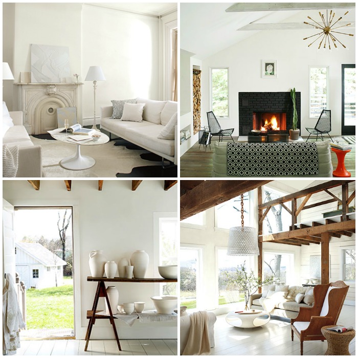
Last week Benjamin Moore announced the Color of the Year for 2016.  And it is white.  More specifically, Simply White.  It was surprising, since there are like a billion paint colors.  But I have to say I love the choice.  Crisp and clean.  A blank canvas to build upon.  However, in full disclosure, I am totally biased.  I recently painted our family room white.  After much research and five pint size samples, I chose White Dove for the walls and Simply White for the trim. I loved Simply White because it was a true white.  The room makes me nothing but happy.

I took a risk when painting the interior doors glossy black.  My hope was that I would love the contrast.  I am so pleased with the results!  Actually, I love them.  The doors add interest to the white room.  It was a delight to read the narrative on Benjamin Moore’s website about using white and black.  It emphasizes striking contrasts and bold lines.


define with black


Well, there you go!  I couldn’t have said it better myself.  I am by no means a designer, so this is kind of awesome.  More importantly, it reaffirmed the importance to follow your gut and do what will make you happy in your home.  No matter a trend or a “of-the-moment” look, it has to be right for you!

How do you feel about white walls?  Do you love it or do you need more color in your life?

A few rooms in white:

Benjamin Moore Simply White | Where is June?

{images via Benjamin Moore}

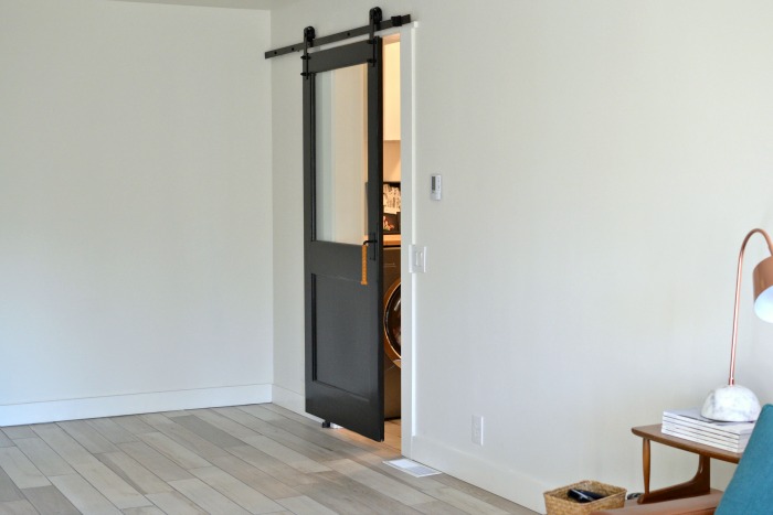
As you can see, our family room is a work in progress. It is a very large, BLANK canvas.  Still working on it.  I promise that I will post more about the room.  Including a post about our vintage sliding door into our laundry room.  It was my harebrained idea that actually worked!

**Post not sponsored. Just inspired.


LEATHER HANDLES FOR DOORS AND DRAWERS

Monday, September 21st, 2015

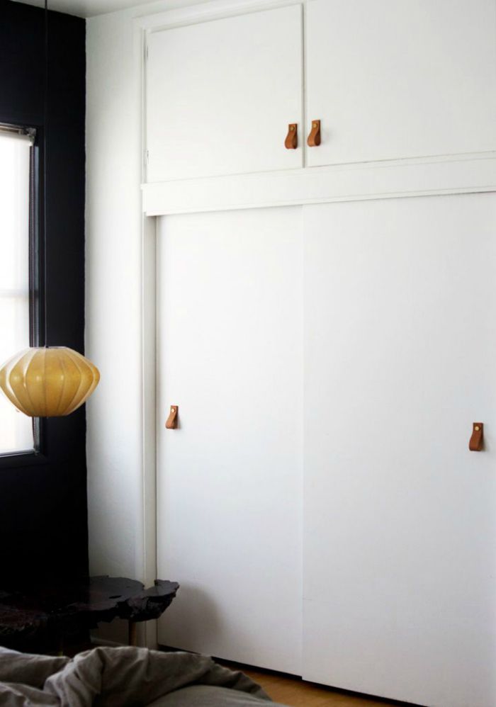
Leather closet pulls

Ok, so it all started with the doors of my beat-up entry way closet begging me to give them a face lift.  They are bi-folding doors and I plan to paint them black. In searching for something different than your typical knob as the pulls, I came across this picture of these amazing leather pulls on closet doors.  Brilliant!  Purchasing them seems to be costly, but I fairly certain I can make my own.  My dad is a skilled leather craftsman and I am willing to bet if I make him freezer jam he would help me bust a few of these out.  The closet doors will need a knob, so it is a loop of leather and a bolt.  We can do this!  Long handles don’t look to be much harder.


leather handles | Where is June?

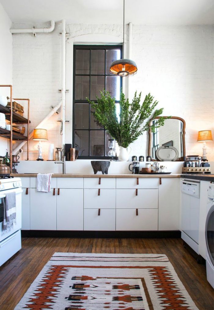
If my little DIY leather adventure works out, I might be swapping all my kitchen knobs and pulls, too!

kitchen leather cabinet pulls | Where is June?

I’ll let you know how it goes!

{Kitchen image via Apartment Therapy}

Knobs 1//2//3

Pulls 1//2//3


A ROOM FOR A FAMILY – BEFORE

Thursday, June 25th, 2015

Remodel-before Where is June

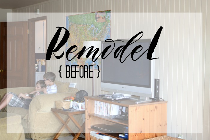
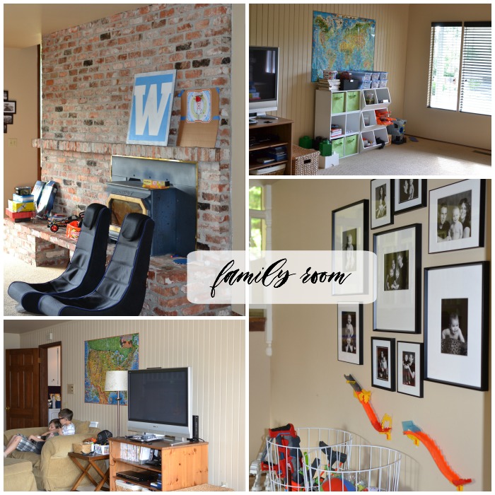
When we moved into our home in 2007, the room on the lowest level of the house struck me as really strange. It was long and narrow, with an extremely large brick fireplace/hearth.  {When we viewed the house before we purchased it, the previous owner had one single arm chair in the middle of the room.  Not helpful.}  With really only one useable wall, it was nearly impossible to have a sofa or any furniture for adults.  I had no idea what to do with it, so it became a play room.   At that time we had VERY young children {ages 5 months and 3 years} so it served to be an extremely important space.  Over time the kids had fewer and fewer toys and we decided it was time to create a space that we could all use and love.  Today I am sharing the before shots and a quick description of our project.

FAMILY ROOM: BEFORE

family room before | Where is June?

Oh, look at all that brick!  The project started out simple: remove the brick fire place, hearth, and insert and create a useable wall.  Like any project it grew over  2+ years of thinking and planning.  In the end the list also included: new lighting, removal of wood paneling {which I had painted}, new flooring, new paint, new molding and base boards.  I also became obsessed with a rolling door to the laundry room.  {Plenty more on that side project later!}  We had not originally planned on updating the laundry room and powder room, but eventually decided it was worth doing all three rooms at once.

LAUNDRY/POWDER ROOM:  BEFORE

laundry and powder room | Where is June?

Our laundry room and powder room are essentially caves.  No natural light at all.  Why I thought it was a great idea to paint them eggplant purple, I will never know!  The number one wish for this space was to move or remove the eye sores above the washer/dryer.  Who doesn’t want an old security system control box front and center?  Also on the list for the laundry room: new washer/dryer, new cabinets, and counter top.  The bathroom: new light, new sink/vanity, new toilet.

I spent months collecting images that served as inspiration for these three rooms. Below are a few of the images/ideas that served as guide posts to decisions I made throughout the process.

A room for a family-Inspiration | Where is June?

More on the outcome and finished looks are coming soon.  The construction is complete and we could not be happier.  Unlike a HGTV design show, the room did not magically come furnished and beautifully styled.  That is a work in progress.

See all my inspiration for this project at A Room for a Family, Sink or Swim, and Loads of Laundry {my Pinterest boards}.

PS: In case you missed these earlier posts, Family Room Inspiration and Remodel- During.


WALLPAPER LOVE

Monday, June 8th, 2015

stateside

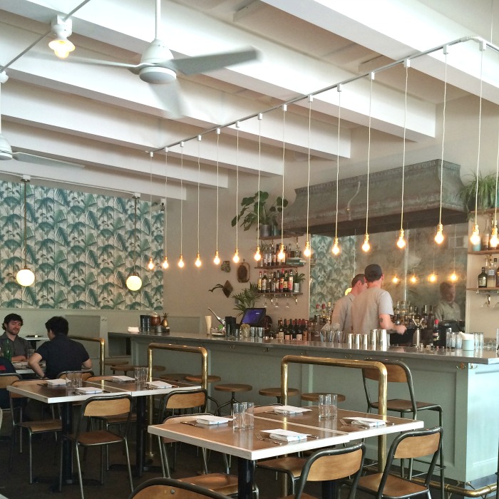
I recently had lunch at Stateside in Seattle.  Yes, the food was delicious but I could not get over the design elements.  Color choice, brass detailing, lighting, a mix of old and new, and that wall paper.  THAT wall paper.  The unexpected pop of green palm fronds and it was oh, so perfect!  I am still thinking about it two weeks later.  A dramatic wall paper can really pack a punch!

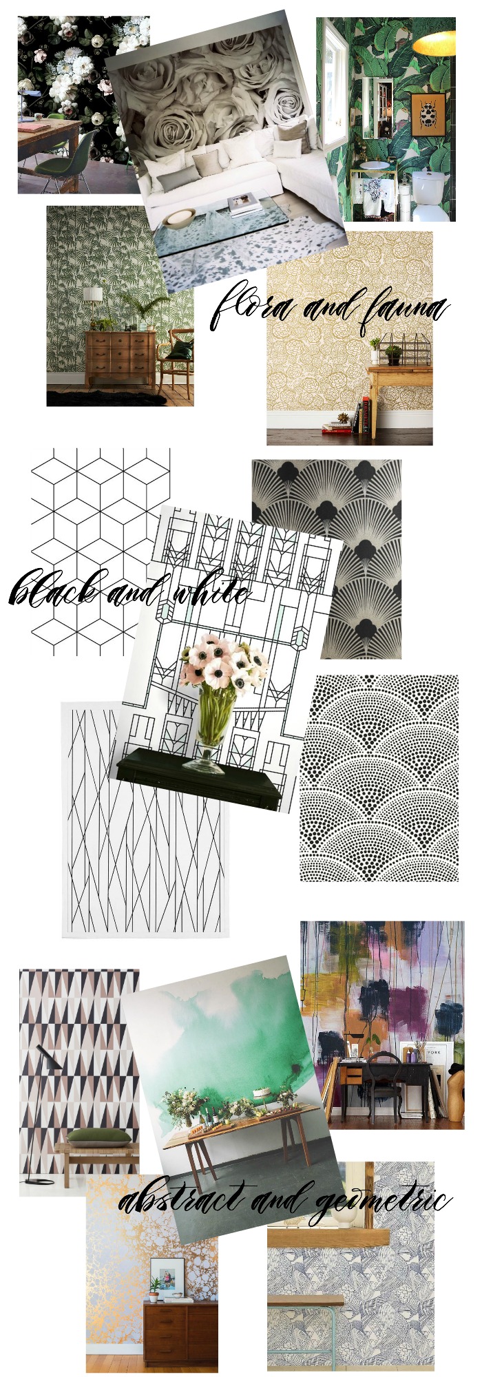
So, I did a little searching:

walll paper love | Where is June?

Which is your favorite?  I could find a way to use any of them in my home!  However, if you have ever had to remove wall paper, you know it isn’t a decision to take lightly.  Do you have wall paper in your home?

{All image sources and other dramatic wall papers can be found here.}


A ROOM FOR A FAMILY – DURING

Tuesday, May 5th, 2015

Remodel Survival

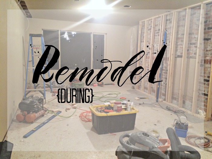
Over a year and half ago, I posted about a possible remodel of our boys’ play room.  They had outgrown the need for a dedicated space just for toys.  When they have friends over, they love to watch movies and play video games.  The time had come to invest in making this space something to love.  A little over three weeks ago, the process began!  While the end vision is coming together, the first stages were a little unsettling.  Massive amounts of demolition and sheet rock dust, made it hard to see how it could all go back together.   I guess surviving and thriving during a remodel is a skill.

Here is what I know so far:

1.  Have a clear vision and budget. 

While others can give input and advice, you need to have your own vision for the space, whether it be a family room, a kitchen, or a bathroom. While I am no designer, but I was clear how I wanted the room to function and the short list of needs.  The least sexiest part of a remodel is the budget.  You have to have a budget.  Decide which details are the most important, so that when you have to make compromises, due to budget constraints, you are still guaranteed a final product you will be happy with.

2.  Learn to love Pinterest.

It has literally helped me make almost every decision.  Paint color, tile, trim work, switches.  You name it, I put it in the search box of Pinterest and found what I wanted.  Visually I could narrow down my choices.  I could then find it just by searching or asking for help from my contractor or a friend.

3.  Appoint a project manager.

I was appointed the project manager.  If my husband and I had to decide every little detail together, we would probably end every evening in an argument.  To save our sanity and keep the project moving along, I have made most of the choices and decisions. He is more interested in the final outcome.  Your project manager should be the person who is most interested in the process and the details.  That’s me and I love it!

4.  Embrace the mess.

You cannot control it, so just go with it.  Hey, how often do you have an excuse for your house to be a disaster?

I can not wait until we are cuddled up on the couch watching a movie in our new room. I promise to post again about this project!

Would you like a peek @ the inspiration for the room and all its details?  Follow along here!


Where is June?


  • Glad You’re Here!

  • Simple Practices

  • Archives

  • Subscribe

    Enter your email address