Archive for the ‘Design’ Category

BOSSLADY UNIFORM: URBAN FLOWER FARMER

Wednesday, April 4th, 2018

This was such a fun post for me!  My sweet cousin, Tia, has become an urban flower farmer.  She is turning her passion of flowers and gardening into a woman-owned business.  In Bloom-Urban Flower Farm, located in Spokane, Washington, will offer weekly subscriptions to fresh flowers, bulk buckets, and flower arrangement parties. In Bloom also plans to be at local farmer’s markets. She asked me to help create an urban flower farmer uniform.  (I added the Bossylady!) How could I say no?  She wanted quick, easy options that would transition from garden, to workshop, to market with out a lot of fuss!  But of course she wants to look her best!  This is what I came up with:

In the Garden (pictured above): 

Her backyard is going to a magical world of flowers.  Time will be spent tending and harvesting in the garden.  Needing something easy-yet not precious since she is going to get dirty- I pulled together vintage denim and t-shirts (new could work as well), chic waterproof boots, and an apron.  She can throw on this easy uniform, down a cup of coffee, and get to work.

In the Workshop (below):

When she hosts evening flower arrangement classes, we cleaned it up a little.  A colorful or striped t-shirt with high rise denim.  AND my all time favorite idea……. the jumpsuit/coverall option.  This is probably a stretch for any of us, but it fits perfectly with her aesthetic!  I REALLY hope she goes for it.  Paired with retro sneakers and an apron, she will be ready for the workshop!

At the Market (below):

During the months that flowers are in bloom, she plans to be at the local farmer’s market.  It is usually very warm in Spokane during the summer months, so I wanted her to look great but still be comfortable.  Long cut-off denim shorts and a breezy shirt is the perfect combo.  A simple cotton dress could be equally easy and a great alternative to living in denim.  A short bistro apron -to stash all her cash -and amazing clogs finish the market uniform.


I am so proud of Tia!  Isn’t her logo just perfect?  If you live in the Spokane area, be sure to check out her amazing offerings.

PS// If you are interested in the sources for any of the pieces I selected, find them on my Bosslady Uniform board.


4 ETSY SHOPS TO LOVE

Tuesday, January 16th, 2018

Some of favorite things in my home have been found in Etsy shops.  I am consistently impressed by the creativity and quality of products offered by shop owners.  I thought it would be fun to share a few shops that are saved as my favorites.

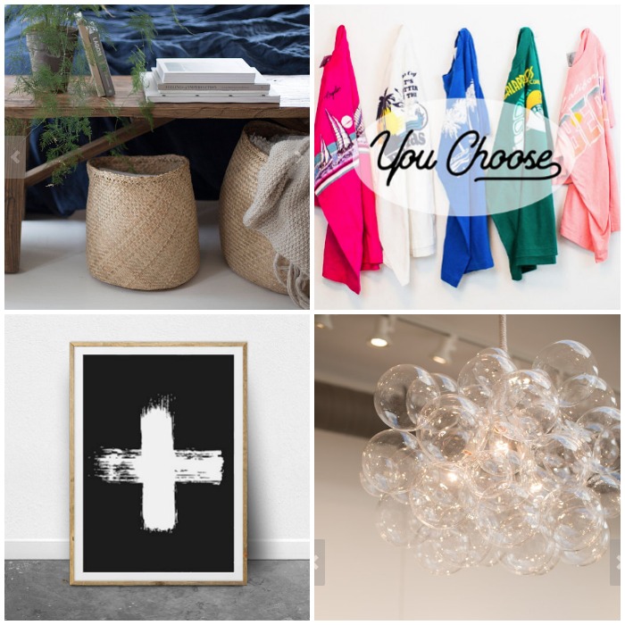
4 Shops to Love (clockwise, starting with top left image):

1|  peastyle  |  Not a large shop, but her natural Seagrass baskets look versatile and perfectly imperfect.

2|  MintThreads owned by Amanda Wade | Authentic vintage threads.  Perfect way to find vintage clothing to add to your wardrobe without having to do all the hunting at thrift stores.  The vintage T’s are my favorite!

3|  TheLightFactory owned by Ashlie Ewen. | Gorgeous light fixtures. Her bubble chandeliers are striking!

4|  ThePrintableStudio | Printable wall art.  Unique and totally approachable.  A great way to add art to your walls with out the heavy price tag.  The prints are sold as instant digital downloads.  Instant gratification.

Do you have any favorite Etsy shops?  Please share!


A STYLED BOOKSHELF

Monday, December 14th, 2015

styled book shelf | Where is June?

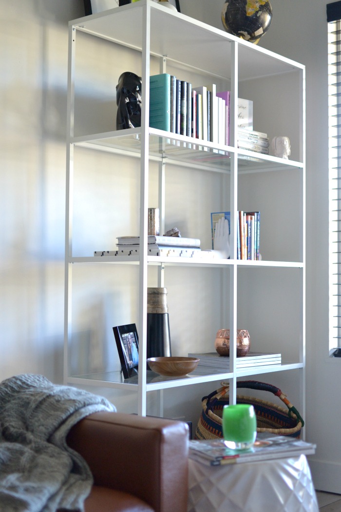
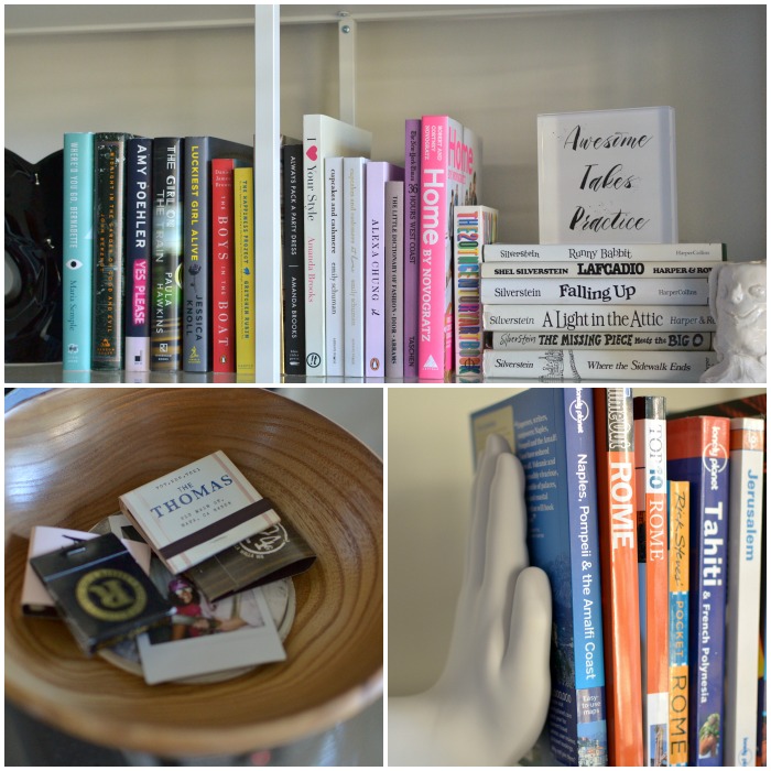
I have been working over the last few months on the finishing touches in my newly remodeled family room.  It surely doesn’t happen over night.  One item we needed was shelving to house our cable modem.  While completely unsightly and not the least bit aesthetically pleasing, it is a necessity of modern-day life.  I chose a very simple unit from IKEA. The white frame and glass shelves makes it an unobtrusive piece of furniture in the room.

After finding a home for all of our hardware on the bottom shelf, I was left with the task of styling the rest of the shelves.  My hope is that as time goes by it will be home to items I love and collect.  I see a family of vintage globes living on the top shelf.  For now, I needed to start with a few things that I had on hand.  Taking tips from Emily Henderson, I focused on a few key elements.  Trays, larger scaled pieces, books, small collections, and cherished items.  Please remember, I am not a designer or a stylist.  I use a little inspiration from the experts and do my best.

styled bookshelf | Where is June?

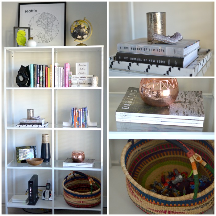
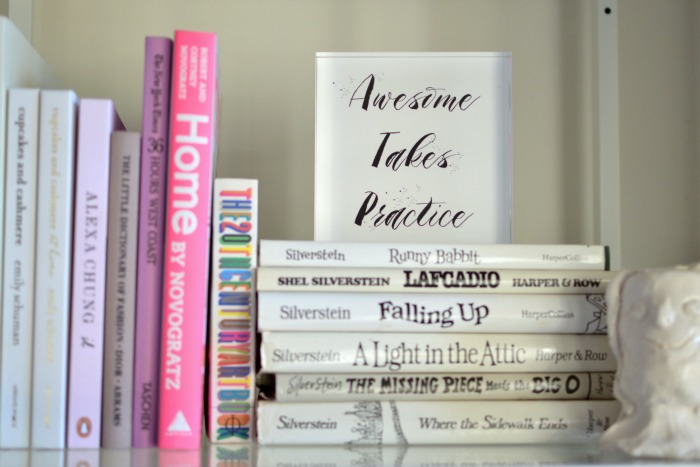
With the center bar in the middle of the shelves, it creates eight small compartments.  I tried to blur these lines a bit with a row of books running all along the first glass shelf.  I needed to use book ends {or get creative with books} to hold books upright on the shelves.  The Shel Silverstein books from my childhood, with white book jackets, were perfect for this.  I continued by adding my favorite books, a lucite tray, candles, vases, a portrait, and pieces created by my boys.  The bottom shelf has a market basket to house miscellaneous toys.  It is still a room for the whole family and those LEGOS need a place at the end of the night.  Keeping with the room’s color palette I stuck with white, black, natural wood, and metallic.  Pops of color come from the book spines and artwork.

Tiny Prints acrylic block | Where is June?

My hope was to include unique items as well.  I adore this acrylic block I created to sit on the shelves.  The phrase “Awesome takes practice.” was on a card I received for my 4oth birthday and I thought it was an outstanding mantra.  Using Tiny Prints and my favorite font, I created the text and uploaded it as an image.  It is the perfect size and looks great with the books.  Plus, it is a great reminder to be awesome everyday!

styled books | Where is June?

I know these shelves will be ever changing.  As we travel and collect new treasures, the objects will change.  I can also add items from other rooms in my home to give the shelves new life!

Sources for a few of the items:

Seattle Map print/GurglePot/Acrylic Block/Hand Bookends/Globe

{Acrylic Block c/o Tiny Prints.}


STRIKING CONTRASTS WITH SIMPLY WHITE

Wednesday, October 14th, 2015

striking contrasts | Where is June?

{our family room}

Last week Benjamin Moore announced the Color of the Year for 2016.  And it is white.  More specifically, Simply White.  It was surprising, since there are like a billion paint colors.  But I have to say I love the choice.  Crisp and clean.  A blank canvas to build upon.  However, in full disclosure, I am totally biased.  I recently painted our family room white.  After much research and five pint size samples, I chose White Dove for the walls and Simply White for the trim. I loved Simply White because it was a true white.  The room makes me nothing but happy.

I took a risk when painting the interior doors glossy black.  My hope was that I would love the contrast.  I am so pleased with the results!  Actually, I love them.  The doors add interest to the white room.  It was a delight to read the narrative on Benjamin Moore’s website about using white and black.  It emphasizes striking contrasts and bold lines.


define with black


Well, there you go!  I couldn’t have said it better myself.  I am by no means a designer, so this is kind of awesome.  More importantly, it reaffirmed the importance to follow your gut and do what will make you happy in your home.  No matter a trend or a “of-the-moment” look, it has to be right for you!

How do you feel about white walls?  Do you love it or do you need more color in your life?

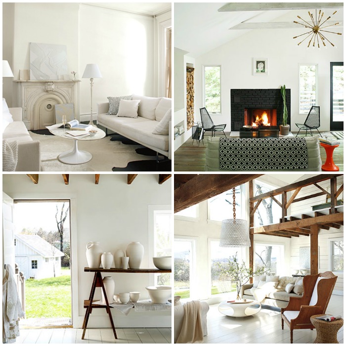
A few rooms in white:

Benjamin Moore Simply White | Where is June?

{images via Benjamin Moore}

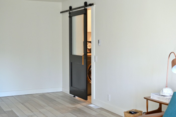
As you can see, our family room is a work in progress. It is a very large, BLANK canvas.  Still working on it.  I promise that I will post more about the room.  Including a post about our vintage sliding door into our laundry room.  It was my harebrained idea that actually worked!

**Post not sponsored. Just inspired.


A ROOM FOR A FAMILY – BEFORE

Thursday, June 25th, 2015

Remodel-before Where is June

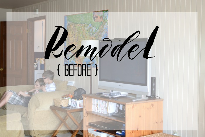
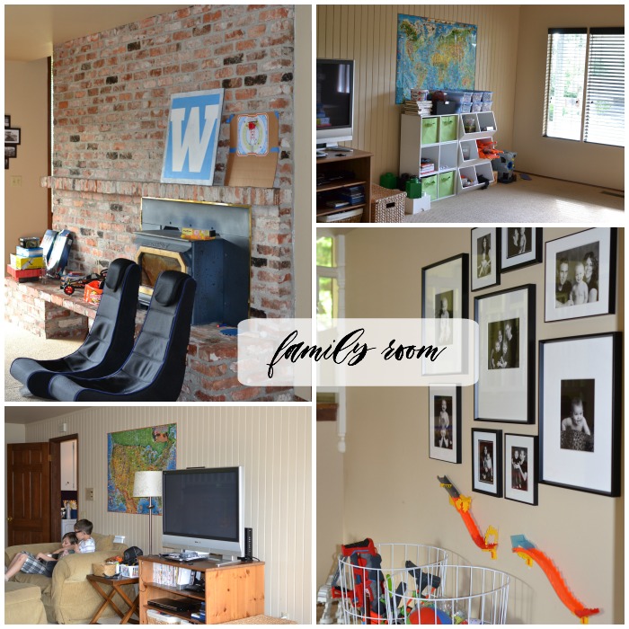
When we moved into our home in 2007, the room on the lowest level of the house struck me as really strange. It was long and narrow, with an extremely large brick fireplace/hearth.  {When we viewed the house before we purchased it, the previous owner had one single arm chair in the middle of the room.  Not helpful.}  With really only one useable wall, it was nearly impossible to have a sofa or any furniture for adults.  I had no idea what to do with it, so it became a play room.   At that time we had VERY young children {ages 5 months and 3 years} so it served to be an extremely important space.  Over time the kids had fewer and fewer toys and we decided it was time to create a space that we could all use and love.  Today I am sharing the before shots and a quick description of our project.

FAMILY ROOM: BEFORE

family room before | Where is June?

Oh, look at all that brick!  The project started out simple: remove the brick fire place, hearth, and insert and create a useable wall.  Like any project it grew over  2+ years of thinking and planning.  In the end the list also included: new lighting, removal of wood paneling {which I had painted}, new flooring, new paint, new molding and base boards.  I also became obsessed with a rolling door to the laundry room.  {Plenty more on that side project later!}  We had not originally planned on updating the laundry room and powder room, but eventually decided it was worth doing all three rooms at once.

LAUNDRY/POWDER ROOM:  BEFORE

laundry and powder room | Where is June?

Our laundry room and powder room are essentially caves.  No natural light at all.  Why I thought it was a great idea to paint them eggplant purple, I will never know!  The number one wish for this space was to move or remove the eye sores above the washer/dryer.  Who doesn’t want an old security system control box front and center?  Also on the list for the laundry room: new washer/dryer, new cabinets, and counter top.  The bathroom: new light, new sink/vanity, new toilet.

I spent months collecting images that served as inspiration for these three rooms. Below are a few of the images/ideas that served as guide posts to decisions I made throughout the process.

A room for a family-Inspiration | Where is June?

More on the outcome and finished looks are coming soon.  The construction is complete and we could not be happier.  Unlike a HGTV design show, the room did not magically come furnished and beautifully styled.  That is a work in progress.

See all my inspiration for this project at A Room for a Family, Sink or Swim, and Loads of Laundry {my Pinterest boards}.

PS: In case you missed these earlier posts, Family Room Inspiration and Remodel- During.


WALLPAPER LOVE

Monday, June 8th, 2015

stateside

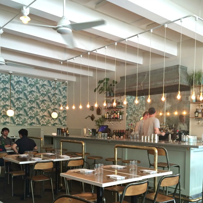
I recently had lunch at Stateside in Seattle.  Yes, the food was delicious but I could not get over the design elements.  Color choice, brass detailing, lighting, a mix of old and new, and that wall paper.  THAT wall paper.  The unexpected pop of green palm fronds and it was oh, so perfect!  I am still thinking about it two weeks later.  A dramatic wall paper can really pack a punch!

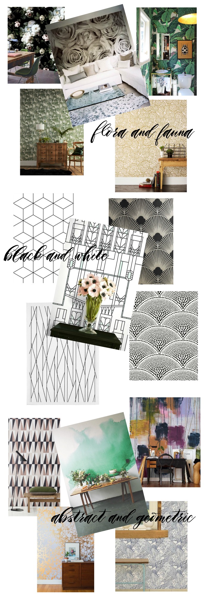
So, I did a little searching:

walll paper love | Where is June?

Which is your favorite?  I could find a way to use any of them in my home!  However, if you have ever had to remove wall paper, you know it isn’t a decision to take lightly.  Do you have wall paper in your home?

{All image sources and other dramatic wall papers can be found here.}


A ROOM FOR A FAMILY – DURING

Tuesday, May 5th, 2015

Remodel Survival

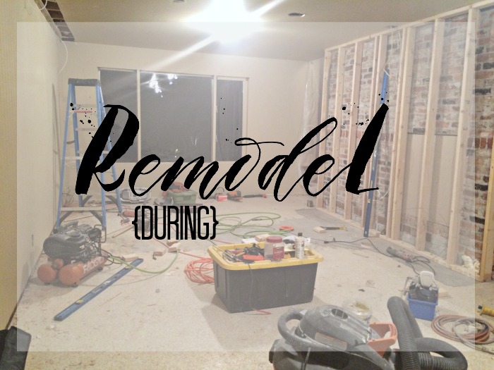
Over a year and half ago, I posted about a possible remodel of our boys’ play room.  They had outgrown the need for a dedicated space just for toys.  When they have friends over, they love to watch movies and play video games.  The time had come to invest in making this space something to love.  A little over three weeks ago, the process began!  While the end vision is coming together, the first stages were a little unsettling.  Massive amounts of demolition and sheet rock dust, made it hard to see how it could all go back together.   I guess surviving and thriving during a remodel is a skill.

Here is what I know so far:

1.  Have a clear vision and budget. 

While others can give input and advice, you need to have your own vision for the space, whether it be a family room, a kitchen, or a bathroom. While I am no designer, but I was clear how I wanted the room to function and the short list of needs.  The least sexiest part of a remodel is the budget.  You have to have a budget.  Decide which details are the most important, so that when you have to make compromises, due to budget constraints, you are still guaranteed a final product you will be happy with.

2.  Learn to love Pinterest.

It has literally helped me make almost every decision.  Paint color, tile, trim work, switches.  You name it, I put it in the search box of Pinterest and found what I wanted.  Visually I could narrow down my choices.  I could then find it just by searching or asking for help from my contractor or a friend.

3.  Appoint a project manager.

I was appointed the project manager.  If my husband and I had to decide every little detail together, we would probably end every evening in an argument.  To save our sanity and keep the project moving along, I have made most of the choices and decisions. He is more interested in the final outcome.  Your project manager should be the person who is most interested in the process and the details.  That’s me and I love it!

4.  Embrace the mess.

You cannot control it, so just go with it.  Hey, how often do you have an excuse for your house to be a disaster?

I can not wait until we are cuddled up on the couch watching a movie in our new room. I promise to post again about this project!

Would you like a peek @ the inspiration for the room and all its details?  Follow along here!


THE MET BALL

Monday, May 4th, 2015

THE MET BALL

The Met Ball is tonight!  I always love the red carpet looks.  A few of my favorites from 2014:

The Olsen girls// inspired men’s wear

Nicole Richie// sleek and silver {but it may also be her purple hair}

Emma Stone// colorful and playful

Blake Lively//glamor and nothing else

Emmy Rossum// full and floral

SJP// over the top with Oscar de la Renta

This year the costume exhibit at the Metropolitan Museum of Art is dedicated to Chinese fashion.  I can’t wait to see what the designers come up with tonight!


DINING ROOM: SPUTNIK CHANDELIER

Monday, March 30th, 2015

Sputnik Chandelier |WHERE IS JUNE?

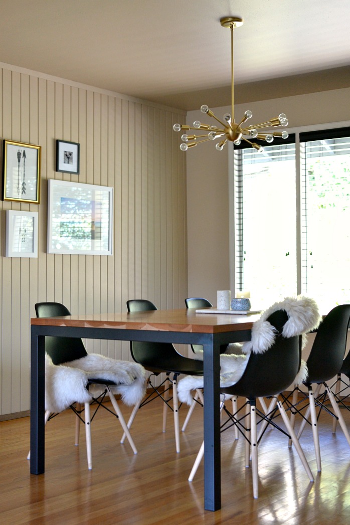
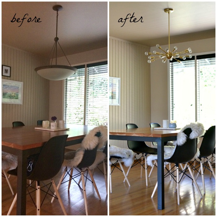
After living in our house almost 8 years, I finally replaced the dining room light which I have hated since the moment we moved in. {It was a perfectly nice light, jut not my style.}   I have been obsessed with the Jonathan Adler Sputnik Chandelier for a long, long time-but it will most likely never fit into my budget.  I began looking for alternatives and even asked for your help.  In the end I couldn’t give up my quest for a Sputnik and returned to my search determined to find one within my budget.  The inter-web gods were listening   I somehow stumbled upon Practical Props and my prayers were answered.  This lovely little lighting shop in Los Angeles, took my order over the phone, customized the drop for my space, and shipped my light to me in two days.    After a little research I found that most designers agree that lights should hang somewhere between 30″ and 36″ above the table.  I customized our light to hang 36″ above the table.  Our old light was incredibly low {See before picture below}.  The quality of the fixture is amazing and I truly love how it looks above our table.

Sputnik | WHERE IS JUNE?

The before and after pictures are a little more dramatic than in real life, thanks to a better camera and a super sunny day in the after shot.  However, you can see how the old light was heavy in appearance and very low to the table!  We are so very happy now.  With 18 individual bulbs the light is abundant from this fixture.  It is excellent that a dimmer switch was already installed.

Ligthing : Before and After | WHERE IS JUNE?

So, now I just have a few finishing touches and this space will be complete.

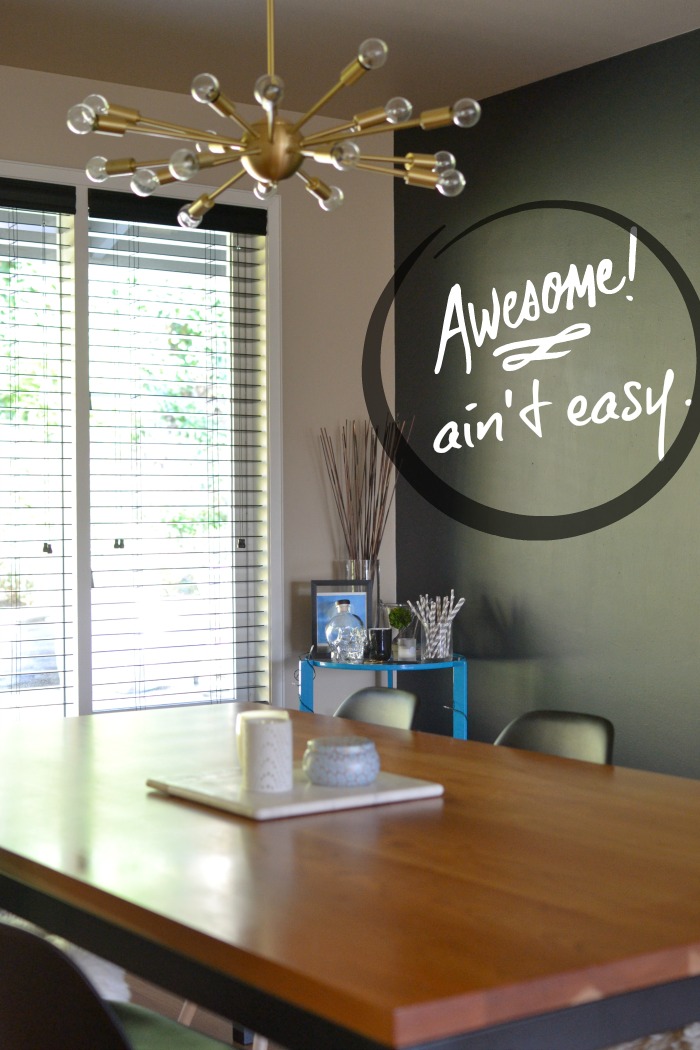
After months of contemplation, I finally painted one of the walls and created a chalkboard wall.  I don’t have a good wide angle lens, so I am not able to capture the entire wall in a shot.  Well, now that it’s done – I need to write on it!  Below I edited the picture to show what it will hopefully look like when I get over myself and just write something.  {Yes, admittedly, I am a perfectionist and wish I was amazing at hand lettering.}  Stay tuned.

Chalkboard Wall | WHERE IS JUNE?

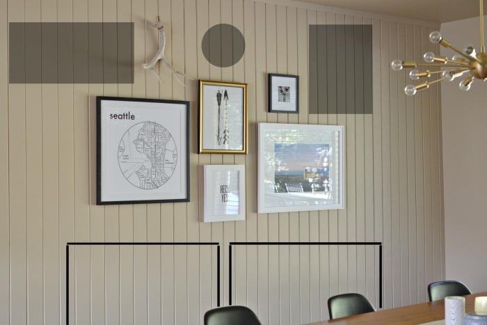
Lastly, I felt like I finally had enough pieces to hang a gallery wall.  I gathered five pieces and varied the frames and mats.  In the end, I stuck to a fairly monochromatic palette.  {It is almost impossible for me to take a picture without glare from the windows.  Sorry!}  In gray I have shown the size of pieces I would like to add in the future.  Also, I still think I need a piece of furniture below the art to anchor it in the room.  My husband is fighting this because the space is not very large.  These extremely slim console tables might be the answer.  Two, side-by-side, in white would be perfection!  I sketched their profile under the art work.  What do you think?

Dining Room -Finishing Touches | WHERE IS JUNE?

For each space in my house, I am constantly dreaming and scheming.  While there is still much to do, I am really happy how this small space is coming together.


CHATEAU DE GUDANES

Wednesday, January 14th, 2015

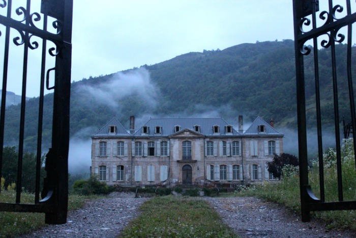
chateau de gudanes

Whoa. Sometimes Facebook gives me gift on a Tuesday.  Yesterday, I spotted a link to photography blog which led me to Chateau de Gudanes.  Breathtaking to say the least, this site and blog documents the abandoned and neglected chateau, the couple who purchased it, and its restoration.

As for their plans for it?

“Our plans for the future keep changing and evolving, and they are only in their infancy, but we hope to welcome you as soon as possible. Ideally, to begin, a cafe and tours, even in its well worn state. By 2016 we would like to also offer you accommodation, a gift shop, and facilities for weddings, music festivals, local fêtes, workshops, conferences, seminars and courses.

Our aim is to tread lightly and gently – to preserve the atmosphere and authenticity of the Chateau and region as much as possible. She will be renovated but her rawness, wear and history will not be erased, but instead integrated. In keeping with this, we also plan to use energy efficient principles and sustainable refurbishment. This means up cycling and recycling as much as possible, including building materials, design features and decor.”

The pictures, even in its run-down state, are something out of a history book.  A beautiful one at that!  I am pretty sure I will be reading the blog updates regularly.  And the pictures on Instagram could brighten even the gloomiest of days!

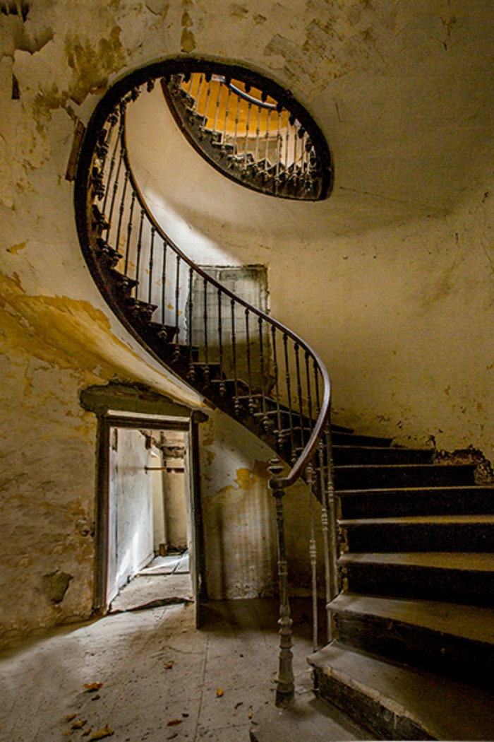
This staircase….

staircase chateau de gudanes

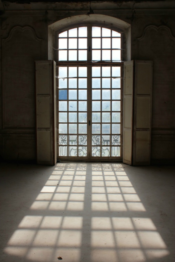
And that light…

window chateau de gudanes

I found this blog post particularly interesting.  {This post is just because.  Because I find it so interesting and I couldn’t help but share it!}

{Images via http://www.chateaudegudanes.org/}


Where is June?


  • Glad You’re Here!

  • Simple Practices

  • Archives

  • Subscribe

    Enter your email address