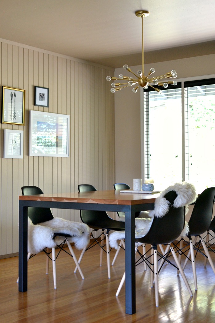
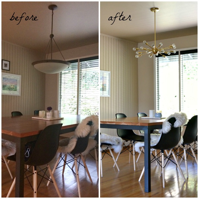
After living in our house almost 8 years, I finally replaced the dining room light which I have hated since the moment we moved in. {It was a perfectly nice light, jut not my style.} I have been obsessed with the Jonathan Adler Sputnik Chandelier for a long, long time-but it will most likely never fit into my budget. I began looking for alternatives and even asked for your help. In the end I couldn’t give up my quest for a Sputnik and returned to my search determined to find one within my budget. The inter-web gods were listening I somehow stumbled upon Practical Props and my prayers were answered. This lovely little lighting shop in Los Angeles, took my order over the phone, customized the drop for my space, and shipped my light to me in two days. After a little research I found that most designers agree that lights should hang somewhere between 30″ and 36″ above the table. I customized our light to hang 36″ above the table. Our old light was incredibly low {See before picture below}. The quality of the fixture is amazing and I truly love how it looks above our table.
The before and after pictures are a little more dramatic than in real life, thanks to a better camera and a super sunny day in the after shot. However, you can see how the old light was heavy in appearance and very low to the table! We are so very happy now. With 18 individual bulbs the light is abundant from this fixture. It is excellent that a dimmer switch was already installed.
So, now I just have a few finishing touches and this space will be complete.
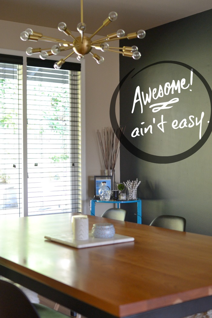
After months of contemplation, I finally painted one of the walls and created a chalkboard wall. I don’t have a good wide angle lens, so I am not able to capture the entire wall in a shot. Well, now that it’s done – I need to write on it! Below I edited the picture to show what it will hopefully look like when I get over myself and just write something. {Yes, admittedly, I am a perfectionist and wish I was amazing at hand lettering.} Stay tuned.
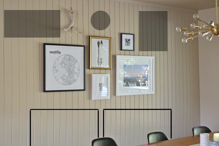
Lastly, I felt like I finally had enough pieces to hang a gallery wall. I gathered five pieces and varied the frames and mats. In the end, I stuck to a fairly monochromatic palette. {It is almost impossible for me to take a picture without glare from the windows. Sorry!} In gray I have shown the size of pieces I would like to add in the future. Also, I still think I need a piece of furniture below the art to anchor it in the room. My husband is fighting this because the space is not very large. These extremely slim console tables might be the answer. Two, side-by-side, in white would be perfection! I sketched their profile under the art work. What do you think?
For each space in my house, I am constantly dreaming and scheming. While there is still much to do, I am really happy how this small space is coming together.
You might also like:
Tags: this place my home







Love it Denise! Your patience and vision are totally paying off.
Love,
Pie
Thanks, Piper! I may actually be in love with this light fixture! xo-d
You are ready for a dinner party! I’ll bring my best bottle of white for you!
I know. Time to break out wine and serve up some delicious food! xo-denise